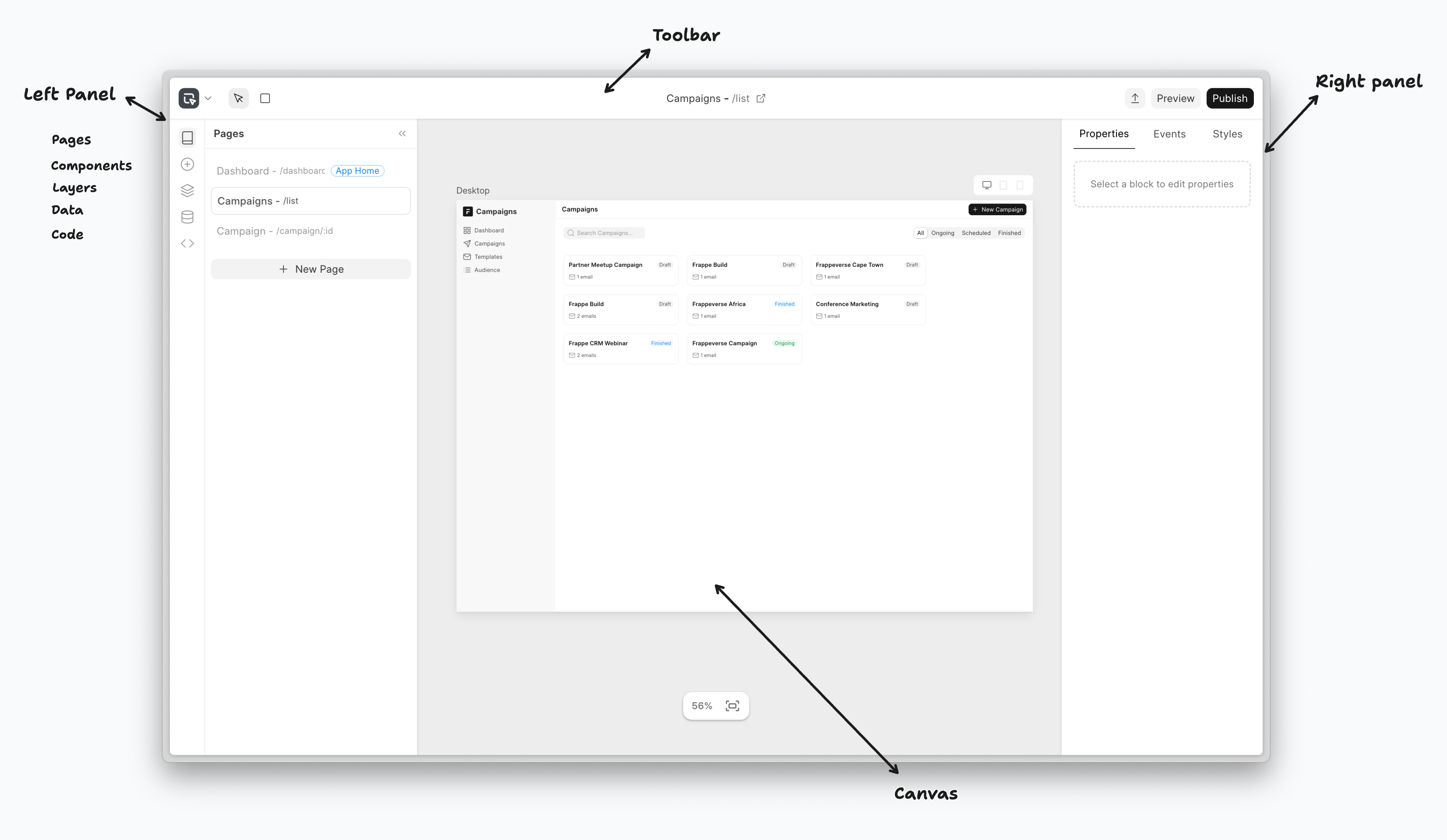
Before we start building applications with Studio, let's first understand its interface. The Editor mainly has 4 parts:
Left Panel: To control page level actions and objects. Also provides access to the component library for drag & drop
Canvas: The space where you design and edit how your page will look like
Right Panel: To control block/component level settings
Toolbar: For quick tools like drawing containers, page settings and buttons to export, preview, publish
Left Panel
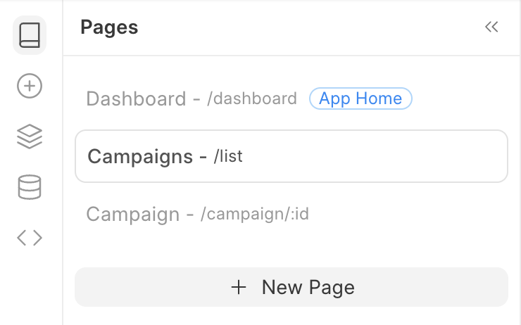
1. Pages Panel: Manages all pages within your Studio application, displaying a list of existing pages with their titles and routes. You can navigate between pages, create new ones, and perform page-level actions like duplication, deletion, or switching the home page. The panel clearly indicates which page is currently active.
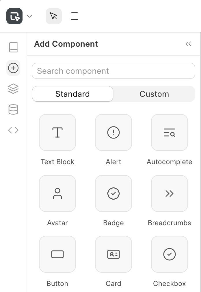
2. Component Panel: Provides access to the component library, divided into standard pre-built frappe-ui components and custom user-created components. Components can be searched and filtered for quick discovery, then dragged directly onto the canvas to add them to your page.
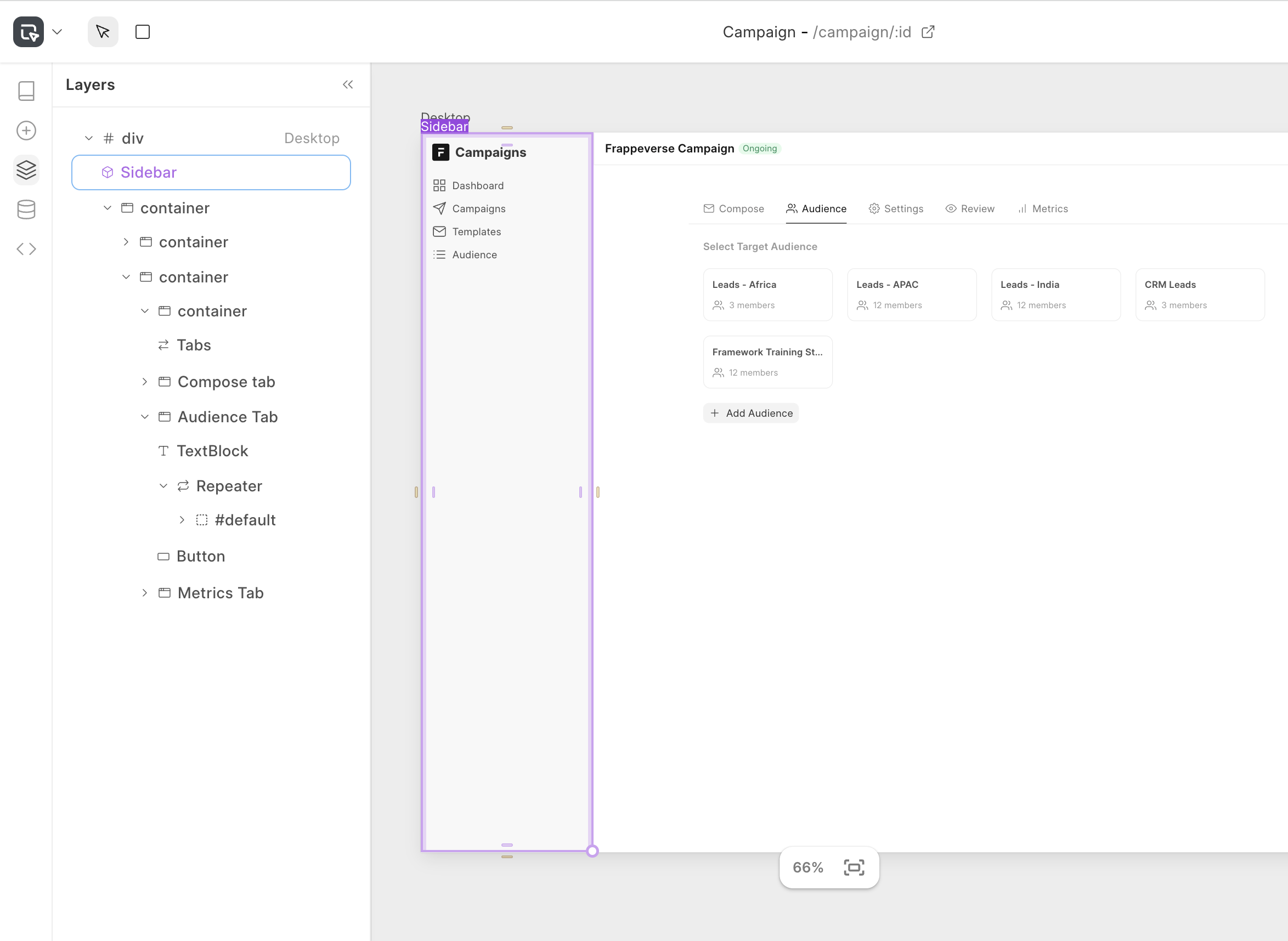
3. Layers Panel: Shows the hierarchical structure of all components on the current page in a tree view format. This panel allows you to select, reorder, and manage the visibility of components through drag-and-drop interactions. It's particularly useful for navigating complex page structures and understanding the parent-child relationships between components.
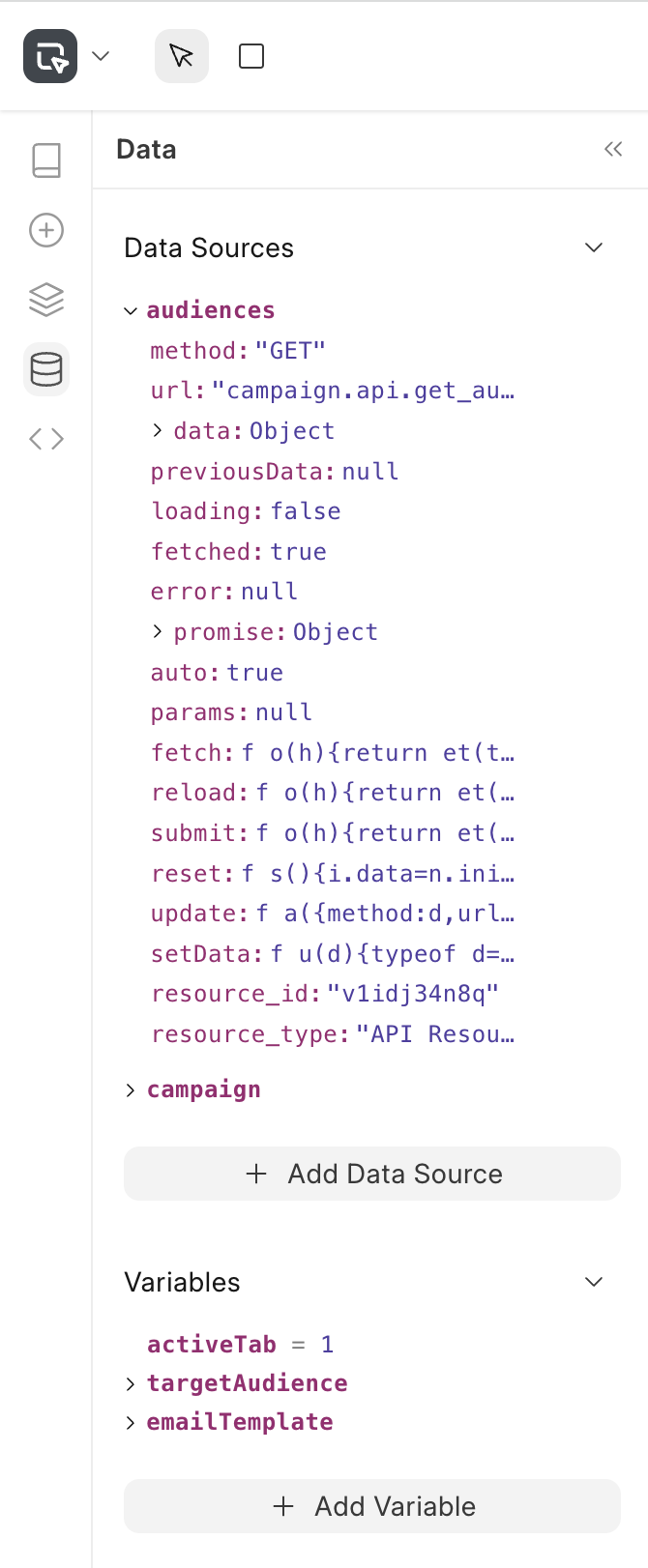
4. Data Panel: Handles all data-related functionality including data sources and application variables. You can configure data sources to connect to Frappe's doctypes or APIs, create and manage reactive variables that store dynamic values, and browse the structure of available data through an interactive object browser.
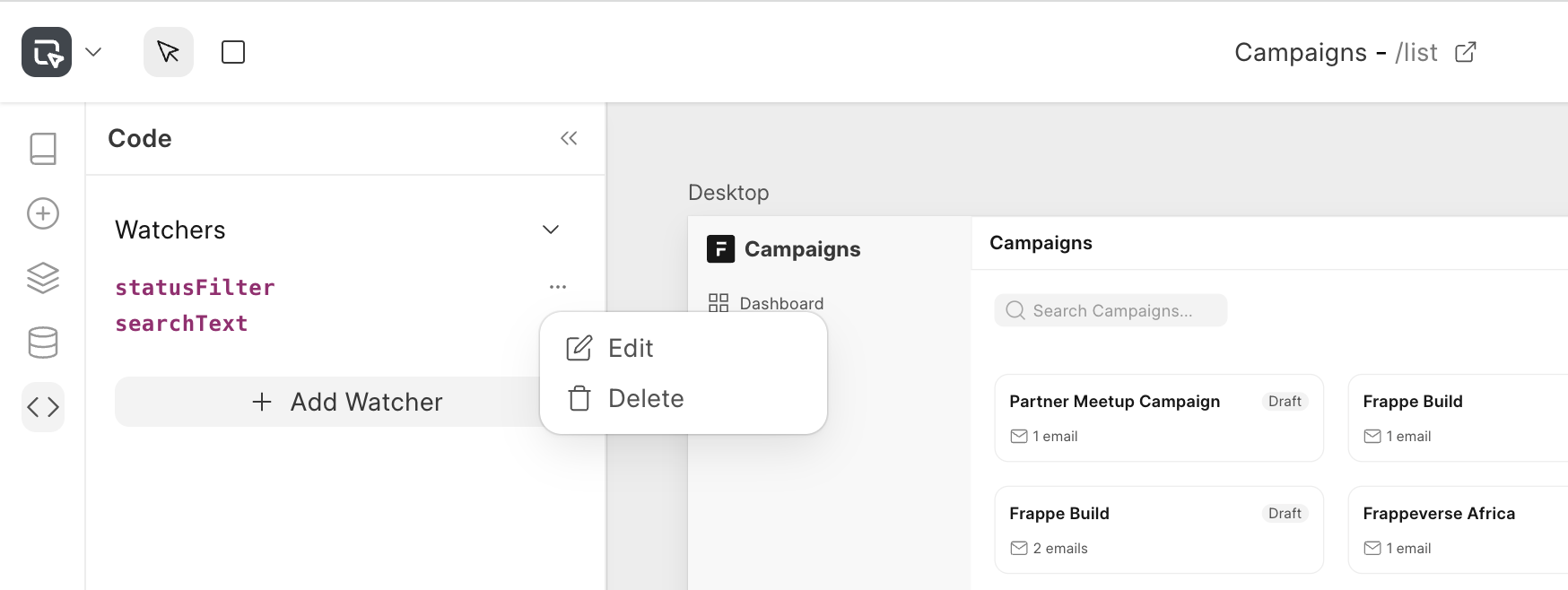
5. Code Panel: Provides advanced scripting capabilities using watchers. Watchers allow you to create reactive code that responds to changes in data sources or variables.
Canvas
Canvas: It is the main space where you build and edit your app pages visually. It shows a live preview of your page with support for multiple device sizes (desktop, tablet, mobile) that you can view simultaneously. You can select any component on the canvas by clicking on it. This opens its properties on the right panel. You can drag new elements from the component panel, and use pan/zoom controls for detailed editing. The canvas maintains full undo/redo history. It also switches between page editing mode for designing complete pages and component editing mode for creating reusable elements.
Right Panel
1. Properties Tab: Configure the core attributes of selected components. You can edit the component's props like variant, theme, size of a button or menu items of a sidebar from here. You can also customise the component's view by adding slots: for eg: prefix, suffix for a button. You can define visibility conditions for blocks through JavaScript expressions, and binding dynamic values to data sources and variables.
2. Events Tab: Define how components respond to user interactions and system events. You can configure actions: Call API, Insert a Document, Run Script on any block's events like click, change, focus, blur, key events, etc.
3. Styles Tab: Adjust your component styles from this panel such as layout, dimensions, position, spacing, borders, etc. It also supports dynamic styling where appearance can be bound to variables and conditions.
4. Interface Tab: Available only when editing custom components, this tab allows you to define the configurable inputs and properties that make your component reusable. You can specify input types, set default values, and create a clean API for your custom component that can be easily configure and used from any page.
Toolbar
The toolbar has quick actions for:
- Drawing containers
- Controlling active page settings for configuring title and route
- Actions
- Preview: Quickly preview the page without publishing
- Publish: Generates optimised version of the page and publishes changes
- Export App Settings: If you are in developer mode on your Frappe site, you will see an export button to enable exporting the Studio app to an existing Frappe app.