Charts
Charts transform your query data into visual insights. You can create multiple charts based on a single query, each highlighting different aspects of your data. Charts automatically update when the underlying query data changes.
Creating a Chart
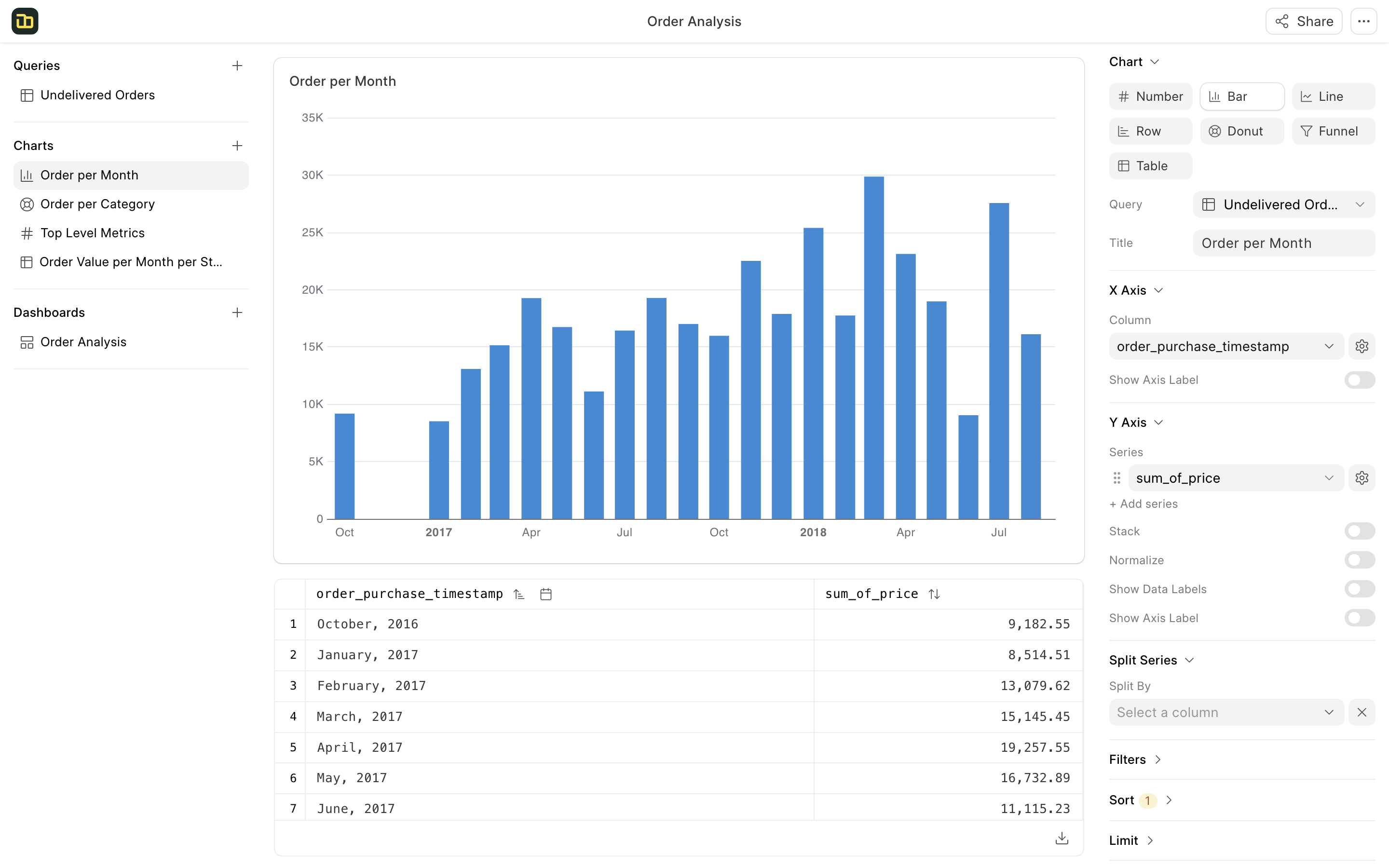
To create a chart, click on the + button next to the chart section in the left panel. The chart builder will open up with options to configure and customize the chart on the right panel.

Chart Types
Number Chart
A number chart is used to display one or more numbers. For instance, you can showcase key metrics such as total sales and total customers. You can select a date column and enable comparison options in the chart settings to display the most recent value along with the change from the previous value.
Line Chart
A line chart is used to display trends over time. The x-axis typically represents a date column, while the y-axis can contain multiple series of numerical data. If you have a single series and want to visualize its breakdown by a specific category, you can designate the split by column in the chart options.
Bar Chart
A bar chart is used to compare values across different categories. The x-axis typically represents a category column, which contains a small number of unique values, while the y-axis can display multiple series of numerical data. If you have a single series and want to visualize the distribution of that series by a specific category, you can set the split by column in the chart options.
Row Chart
The row chart is similar to the bar chart, but its orientation is vertical. The x-axis is displayed vertically, which is useful when there are long category names. This vertical orientation also allows for the display of a greater number of categories.
Donut Chart
The donut chart is used to show the distribution of values across a small number of categories. This chart is best utilized when there are fewer than 5 categories and a significant difference in the values exists.
Table Chart
A table chart is used to display raw data in a tabular format, similar to a Pivot Table in Excel. You can select rows, columns, and values to display in the table.
Chart Actions
Filter
You can filter the chart data based on the underlying query columns. You can create multiple charts based on the same query and apply different filters to each chart. This allows you to focus on specific segments of the data.
Sort
You can sort the chart data based on a column in ascending or descending order. You can find the sort option in the table header as well.
Limit
You can limit the number of rows displayed in the chart. This is useful when you have a large dataset and want to focus on the top or bottom values. For instance, you can limit the chart to display the top 10 customers by sales.
Share
You can share the chart with a public link. Users with the link will be able to view the chart without logging in. You can also copy the embed code to embed the chart in a website or blog.