
Create Your First Dashboard
In this guide, we'll create a comprehensive sales performance dashboard using the Demo Data that comes with Frappe Insights. We'll walk through creating a query, building multiple charts, and combining them into an interactive dashboard.
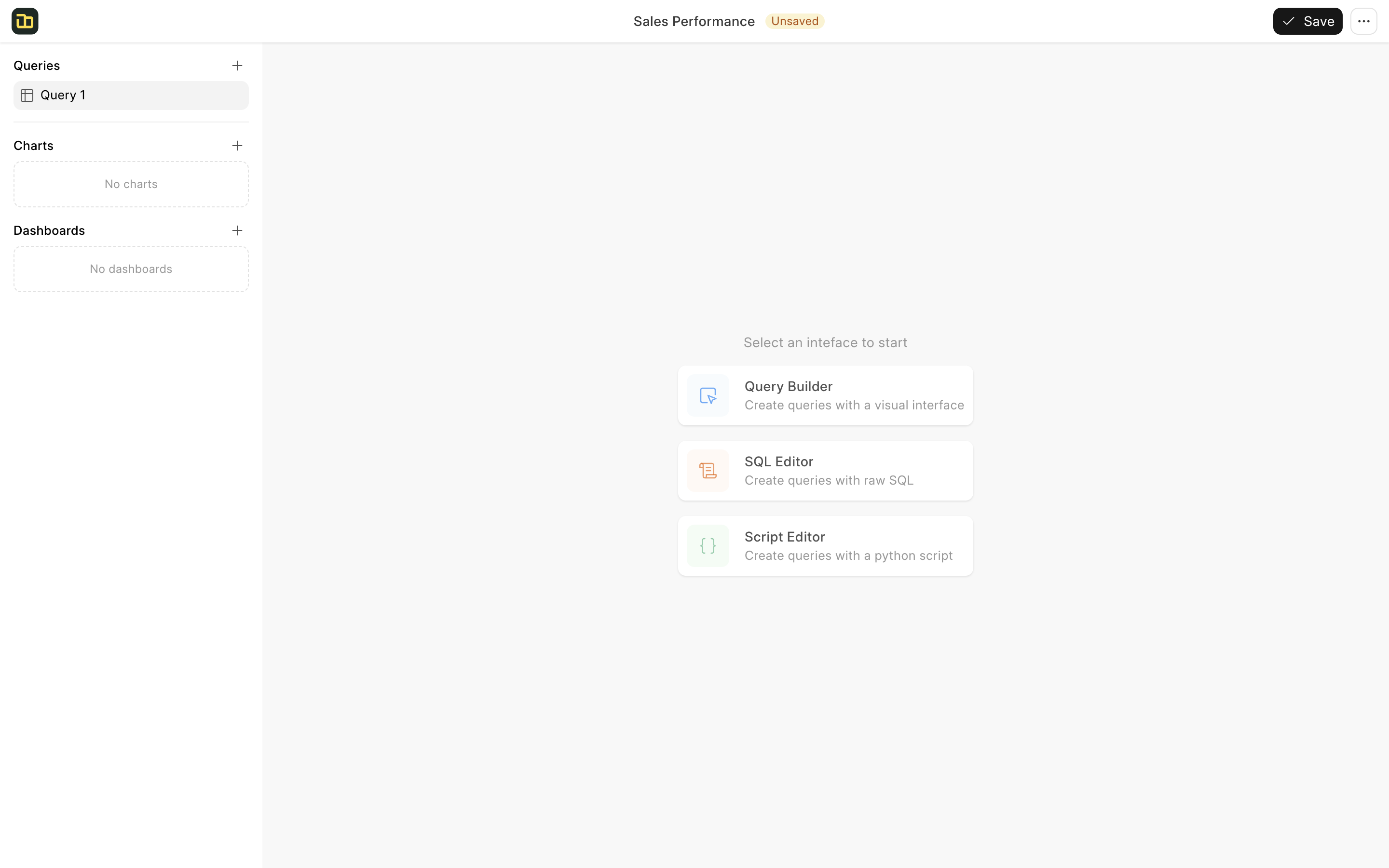
1. Create a Workbook
- On the Workbook list page, click + New Workbook
- Name it "Sales Performance"
- Click on "Query Builder"
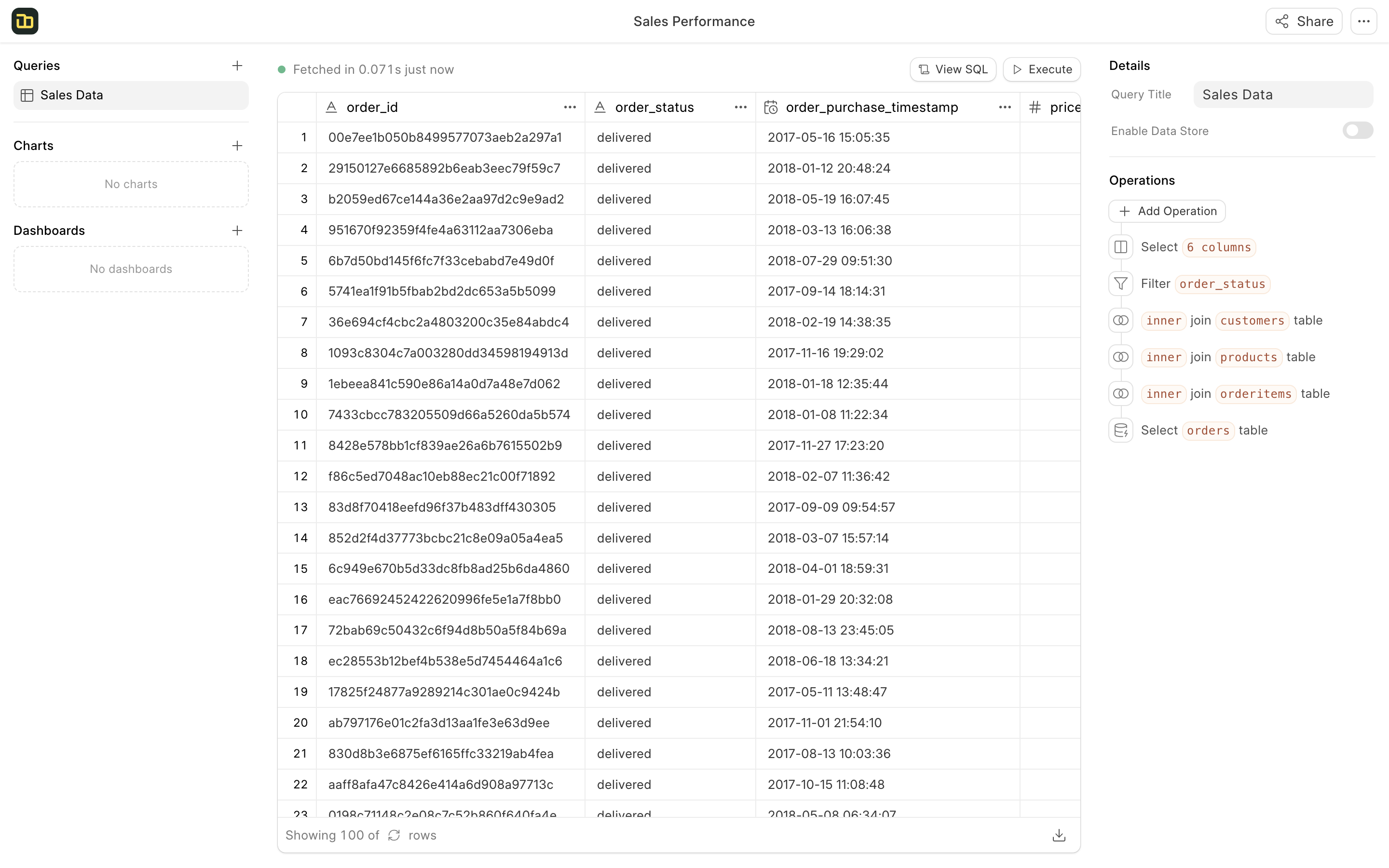
2. Create the Base Query
Let's create a query that combines data from multiple tables. When the query builder opens, select orders as your source table. Add the following operations in sequence:
Join Tables
-
Click Add Operation → Join Table
- Select
orderitems - Join Type: Left Join
- Join On: order_id = order_id
- Select columns: price, freight_value, product_id
- Select
-
Click Add Operation → Join Table
- Select
products - Join Type: Left Join
- Join On: product_id = product_id
- Select columns: product_category_name
- Select
-
Click Add Operation → Join Table
- Select
customers - Join Type: Left Join
- Join On: customer_id = customer_id
- Select columns: customer_state
- Select
Filter and Select
-
Click Add Operation → Filter Rows
- Column: order_status
- Condition: Equals
- Value: "delivered"
-
Click Add Operation → Choose Columns
- order_id
- order_item_id
- order_status
- order_purchase_timestamp
- price
- freight_value
- product_category_name
- customer_state
-
Name your query "Sales Data"
3. Create Charts
Now let's create various charts to visualize our sales data:
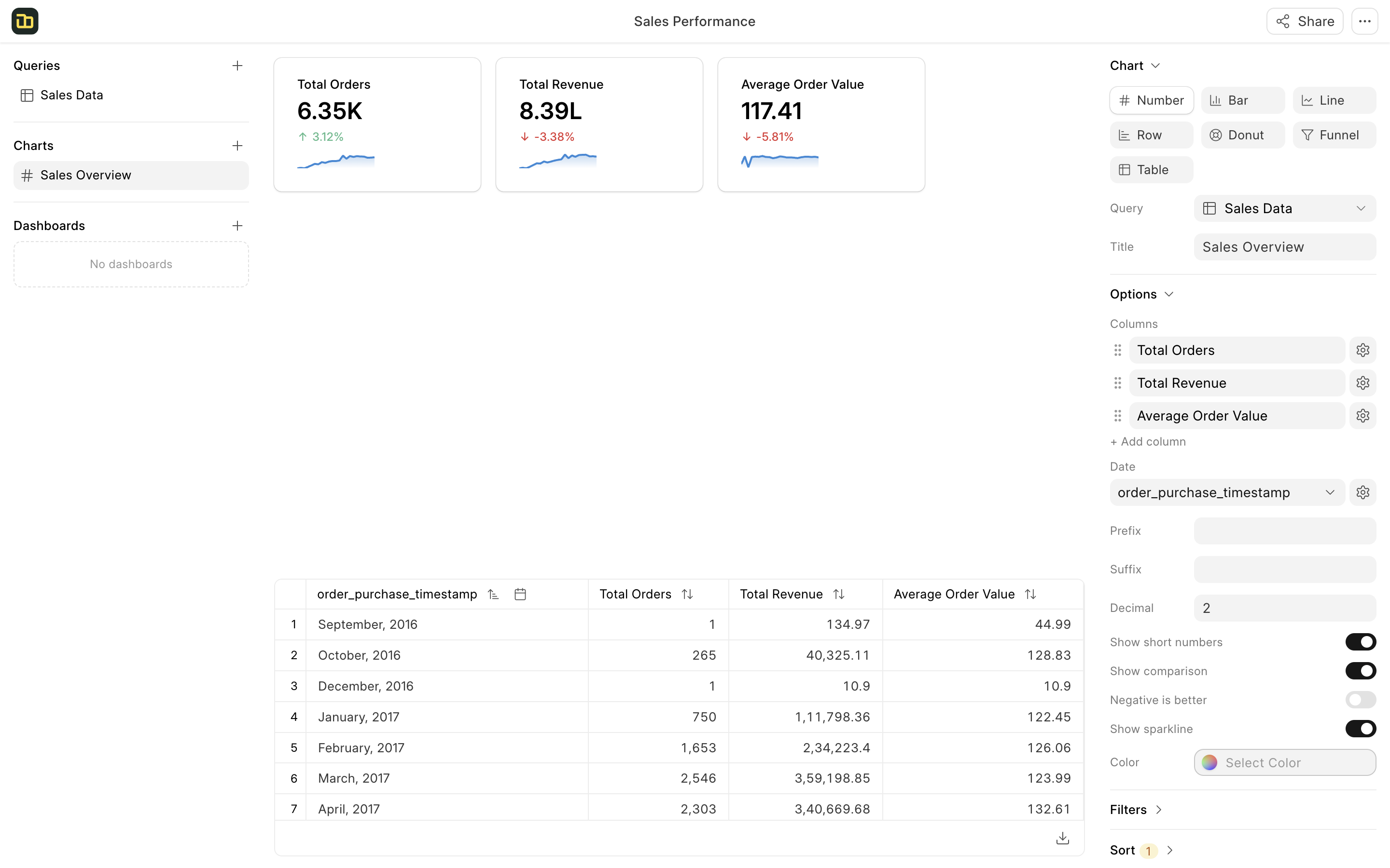
Sales Overview
- Click + New Chart
- Chart Type: Number
- Title: "Sales Overview"
- In the Columns section:
- Click + Add Column
- Function: Count Distinct
- Column: order_id
- Click the gear icon to set label as "Total Orders"
- Click + Add Column
- Function: Sum
- Column: price
- Click the gear icon to set label as "Total Revenue"
- Click + Add Column
- Function: Average
- Column: price
- Click the gear icon to set label as "Average Order Value"
- Select "order_purchase_timestamp" as the Date Column
- Sort: order_purchase_timestamp (Ascending)
- Enable "Show Comparison"
- Enable "Show Sparkline"
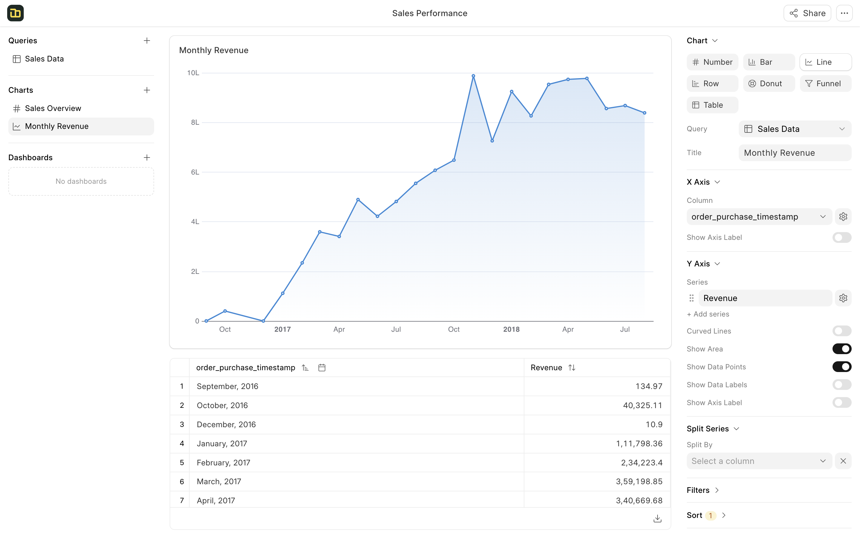
Revenue by Month
- Click + New Chart
- Chart Type: Line
- Title: "Monthly Revenue"
- X-axis:
order_purchase_timestamp - Y-axis:
- Function: Sum of
- Column: price
- Click the gear icon to set label as "Revenue"
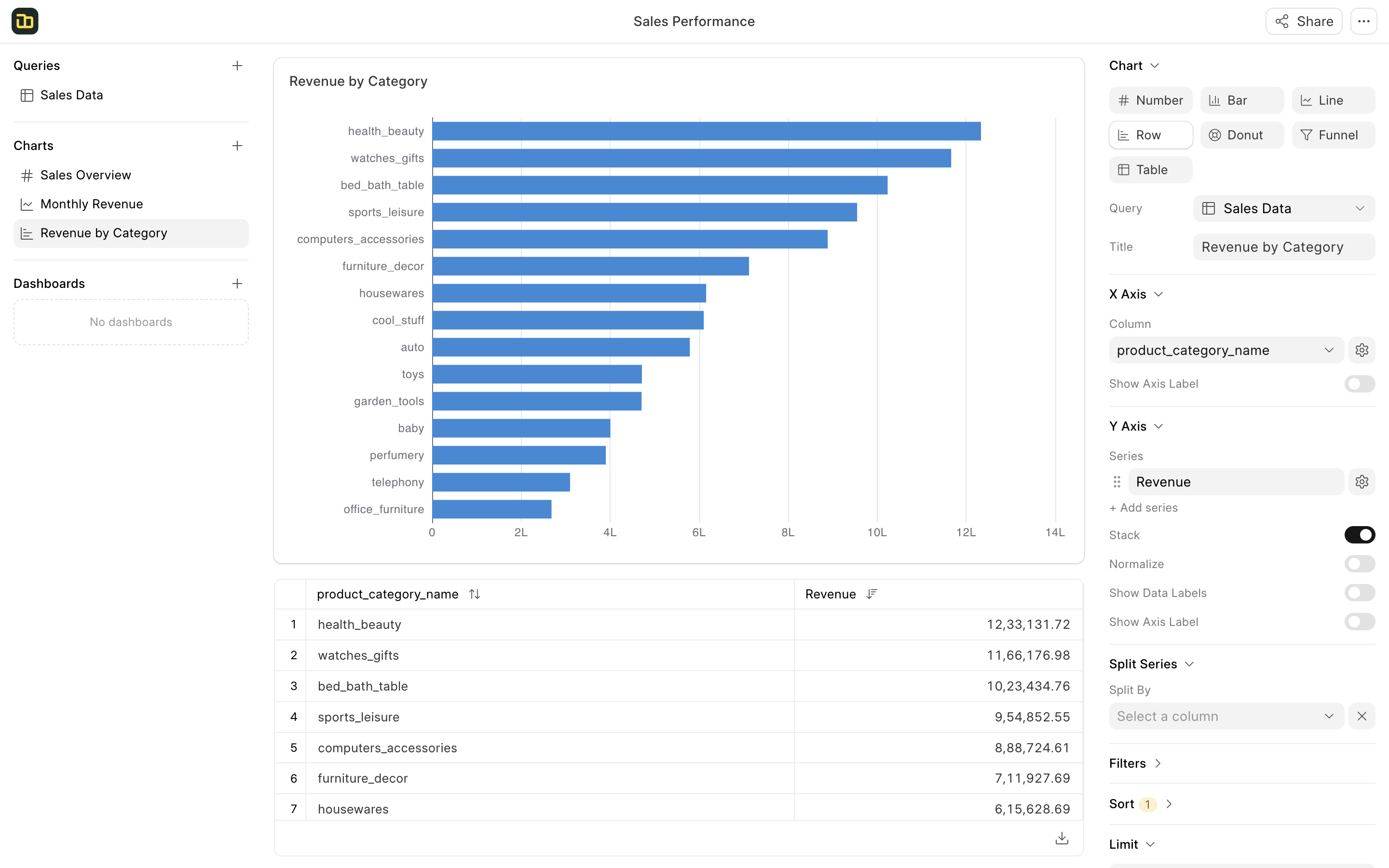
Revenue by Product Category
- Click + New Chart
- Chart Type: Row
- Title: "Revenue by Category"
- X-axis: product_category_name
- Y-axis:
- Function: Sum of
- Column: price
- Click the gear icon to set label as "Revenue"
- Sort: Revenue (Descending)
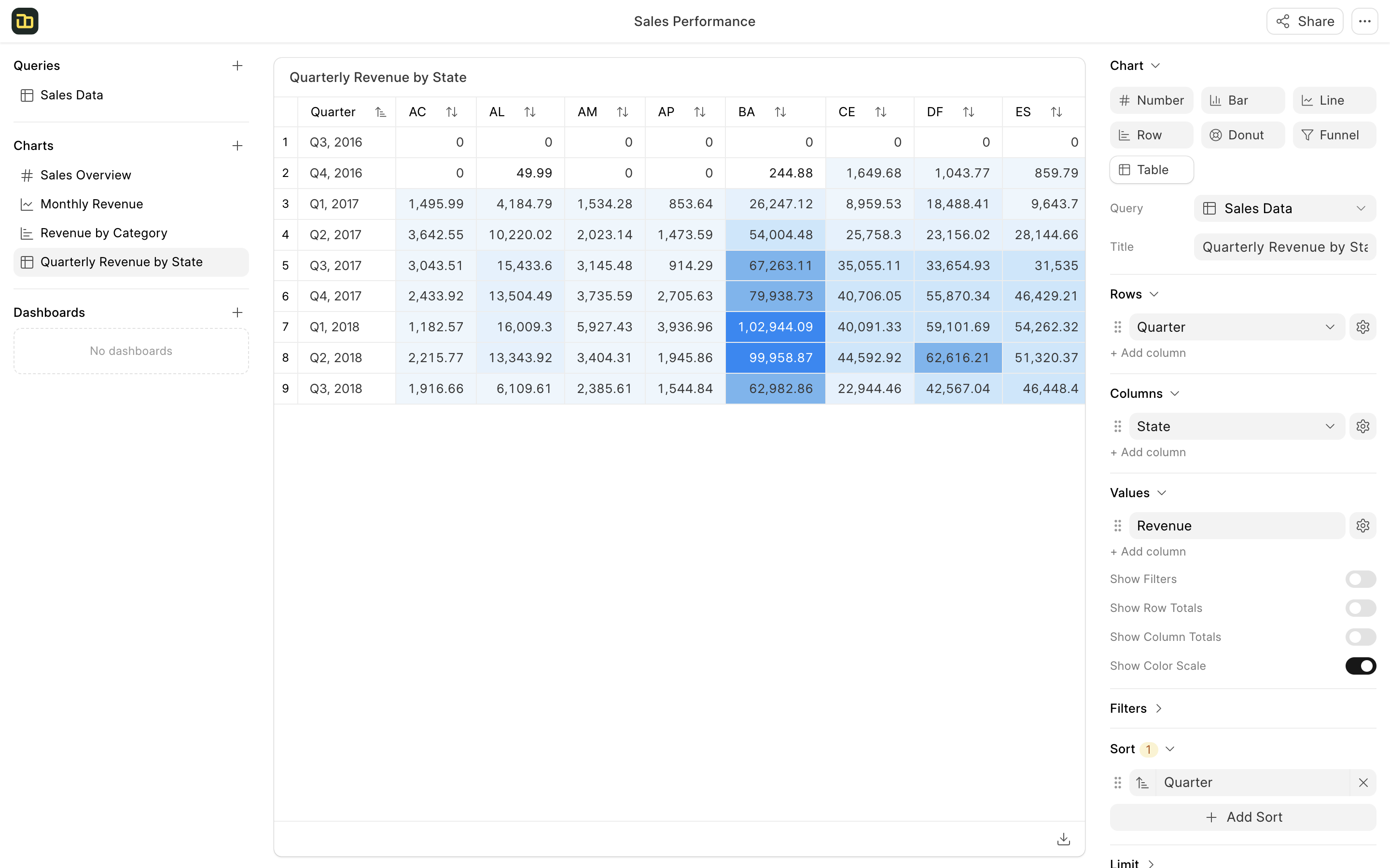
Quaterly Revenue by State
- Click + New Chart
- Chart Type: Table
- Title: "Quarterly Revenue by State"
- Rows:
- Column: order_purchase_timestamp
- Click the gear icon to set label as "Quarter" & granularity as "Quarter"
- Columns:
- Column: customer_state
- Click the gear icon to set label as "State"
- Values:
- Function: Sum of
- Column: price
- Click the gear icon to set label as "Revenue"
- Sort: Quarter (Ascending)
- Enable "Show Color Scale"
4. Build the Dashboard
Let's combine all charts into an interactive dashboard:
-
Click + New Dashboard
-
Set title to "Sales Performance Dashboard"
-
Drag and drop the charts from the left panel to the dashboard:
- First row: Add "Sales Overview" chart
- Second row: Add "Monthly Revenue" & "Revenue by Category" charts
- Third row: Add "Quarterly Revenue by State" chart
-
Apply dashboard filters:
- Click on the Filter button on the top right
- Click on Add Filter in the filter dialog
- Select
product_category_nameas the filter column - Select
health_beautyas the filter value - Click Apply Filter
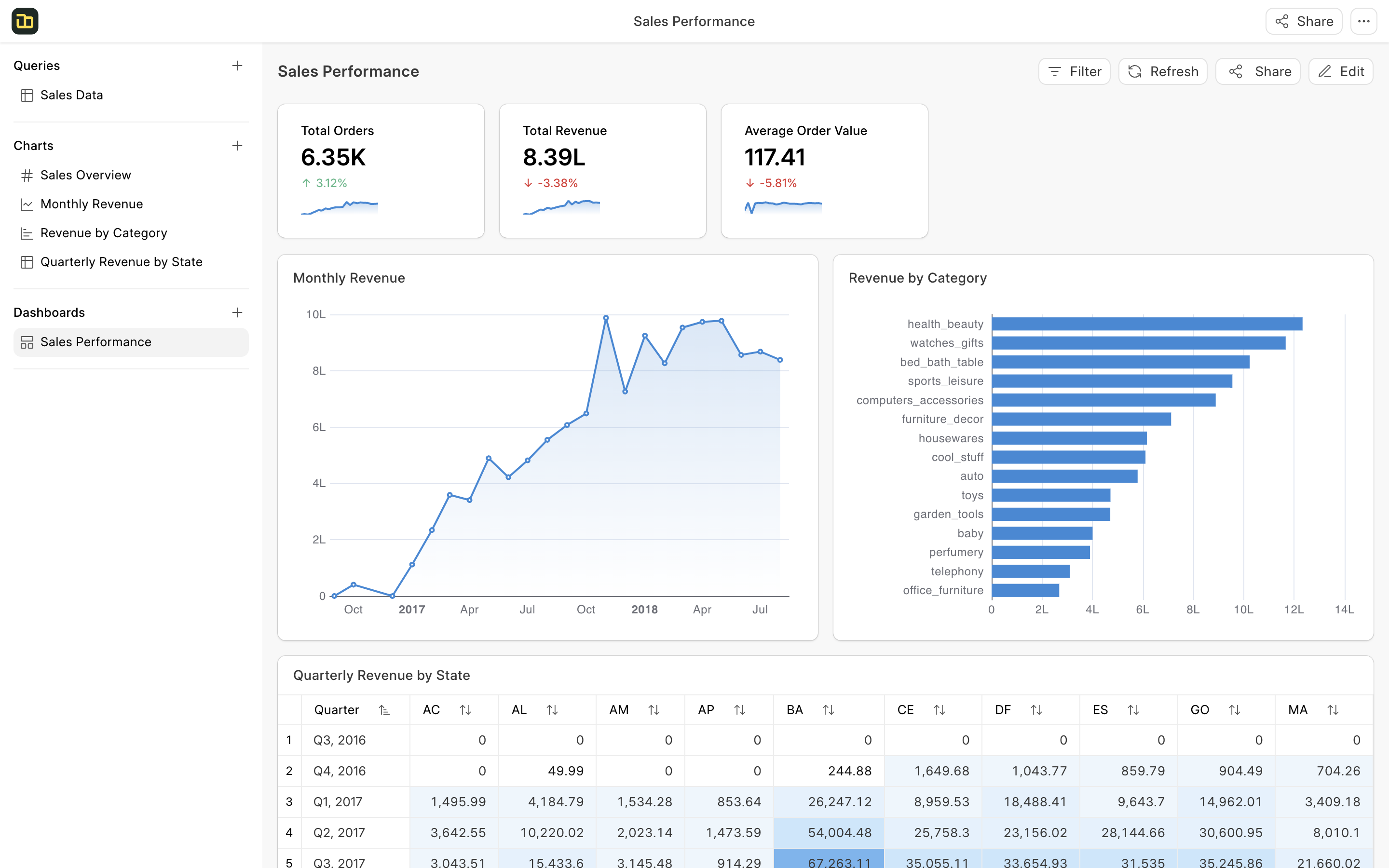
This sample dashboard gives a complete view of the sales performance, from high-level metrics to detailed breakdowns by category and location. The filters allow you to drill down into specific segments and analyze the data further.