
Choosing the right Chart
Chart Types Explained
Number Chart
Best for: Displaying one or more key metrics prominently
Perfect when
- You want to show a KPI (Key Performance Indicator) at a glance
- You're building a dashboard header with important numbers
- You want to compare this month vs last month
Example uses
- Total Revenue: $1.2M
- Active Users: 5,432
- Conversion Rate: 3.4%
How to Configure
- Columns: Choose which numbers to display Can show multiple numbers side by side Each gets its own big display
- Date Column (optional): For comparisons and sparklines Enables "Show comparison" feature Shows percent change from previous period
- Formatting: Prefix: Add $ or other symbols before the number Suffix: Add % or other symbols after Decimal places: How many decimals to show Shorten numbers: Turn 1,200,000 into 1.2M
- Advanced: Show comparison: Display % change from previous period (needs date column) Negative is better: Green when numbers go down (for costs, errors, etc.) Show sparkline: Mini line chart showing the trend Sparkline color: Choose the line color
Pro Tips
Use Number charts at the top of dashboards for immediate impact Keep it to 34 numbers max for readability Enable comparisons to show if metrics are improving Use sparklines to show trend direction at a glance
Bar Chart
Best for: Comparing values across categories
Perfect when
Comparing sales across regions Showing revenue by product Ranking top performers
Example: Monthly sales comparison, Product category performance
How to Configure
- XAxis: Choose your categories (Region, Product, Month, etc.) This is what appears along the bottom Can rotate labels if names are long
- YAxis: Choose what to measure (Sales, Count, Average, etc.) Add multiple measures to show several bars per category Set min/max values to zoom in on a range Show data labels to display exact values on bars
- Chart Style: Stack: Stack multiple series on top of each other (see total height) Overlap: Show bars side by side overlapping Normalize: Show as 100% stacked (proportions)
- Split By (optional): Break down each category further Example: Sales by Month, split by Region Each month shows multiple bars (one per region) Limit max splits to avoid clutter (default: 10)
Pro Tips
Use horizontal labels for short names, rotate for long names Stack bars when you want to show total AND composition Side-by-side bars are easier to compare exact values Limit categories to 1015 for readability
When to Use Bar vs Row: Bar (vertical): Better for time periods (months, quarters) Row (horizontal): Better for many categories or long labels
Row Chart
Best for: Comparing categories horizontally (same as Bar chart, rotated)
Perfect when
You have many categories to compare Category names are long You want to rank items top to bottom
Example: Top 20 products by sales, Employee performance rankings
Row charts are configured exactly like Bar charts, just rotated 90 degrees. All the same options apply!
When to use Row instead of Bar
Long category names (easier to read horizontally) Ranking lists (top to bottom feels natural) Many categories (vertical scrolling is easier)
Line Chart
Best for: Showing trends over time
Perfect when
Tracking revenue over months Monitoring daily active users Showing seasonal patterns
Example: Sales trend over 12 months, Website traffic by day
How to Configure
- XAxis: Usually a date/time column Set granularity: day, week, month, year Rotate labels if needed
- YAxis: What to plot (Sales, Users, Orders, etc.) Add multiple lines to compare trends Each line can be a different color
- Line Style: Curved lines: Smooth curves vs straight lines Show area: Fill the area under the line Show data points: Display dots at each data point
- Split By (optional): Create multiple lines Example: Revenue over time, split by Region Creates one line per region Each line autocolored differently
Pro Tips
Line charts are THE best choice for time series data Use curved lines for a polished look Show area fill to emphasize magnitude Avoid more than 57 lines (gets messy) Use different colors for each line
Common Patterns
Month-over-month growth: Xaxis = Month, Yaxis = Total Sales Daily actives: Xaxis = Day, Yaxis = Count of Users Comparison: Use split by to show multiple products on same chart
Donut Chart
Best for: Showing parts of a whole (proportions)
Perfect when
Market share breakdown Budget allocation Traffic sources distribution
Example: Sales by Product Category (shows % of total), Revenue by Region
How to Configure
- Label Column: The categories (Product, Region, Source, etc.) Each unique value becomes a slice
- Value Column: What to measure (Sales, Count, etc.) Determines slice size Automatically shows as percentages
- Display Options: Legend Position: Top, Bottom, Left, or Right Max Slices: Limit slices (groups small values into "Others") Inline Labels: Show labels inside slices instead of in legend
Pro Tips
Best with 37 categories (too many slices = hard to read) Set max slices to group small values into "Others" Use inline labels when you have few, large slices Colors autoassigned, but you can't customize them per slice
Donut vs Pie: Donuts look more modern and are easier to label. They're the same thing functionally!
Funnel Chart
Best for: Showing stages in a process where values decrease
Perfect when
Sales funnel (Leads → Qualified → Demo → Closed) Conversion funnel (Visitors → Signup → Activated → Paid) Application process (Applied → Screened → Interviewed → Hired)
Example: Ecommerce funnel showing dropoff at each step
How to Configure
- Label Column: The stage names (Visit, Cart, Checkout, Purchase) Order matters! Sort your query to put stages in order
- Value Column: The count or amount at each stage Funnel automatically shows dropoff between stages
- Label Position: Left: Labels on left side Right: Labels on right side Alternate: Alternate left and right
Pro Tips
Always sort your data in funnel order before charting Funnel automatically calculates conversion rates between stages Great for presentations instantly shows where you lose people
Table Chart
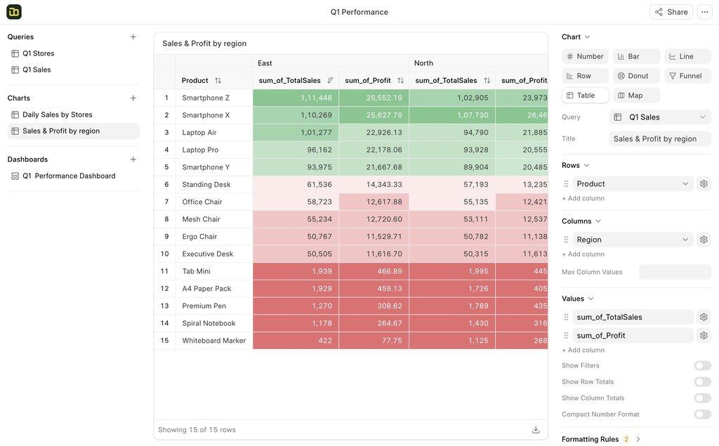
Best for: Displaying detailed data in rows and columns
Perfect when
You need to show exact values Data needs to be searchable/filterable Creating reports people will export Building pivot tables
Example: Customer list with details, Sales by Product and Month
How to Configure
- Rows: What becomes row headers (Customer, Product, Date, etc.) Can add multiple row dimensions Creates groupings/hierarchies
- Columns (optional): Create pivot table Values become column headers Example: Months become columns
- Values: What to display in cells (Sales, Count, Average, etc.) Can show multiple values
- Display Options: Show filter row: Add search boxes to each column Show totals: Add row and column totals Compact numbers: Show 1.2K instead of 1,200 Color scale: Heat map coloring (high values = darker) Sticky columns: Pin columns when scrolling
- Conditional Formatting: Color cells based on rules Highlight values above/below threshold Color scales (red to green) Custom rules
Pro Tips
Tables are perfect when exact numbers matter Use pivot mode (add columns) for crosstabulation Enable filter row for large datasets Sticky columns keep important columns visible while scrolling Color scale mode makes patterns jump out
Map Chart
Best for: Visualizing data geographically
Perfect when
Sales by country Users by region Store locations and performance
Example: Revenue by Country, Support tickets by State
How to Configure
- Map Type: Choose your geography World Map: All countries India: Indian states
- Location Column: Column with location names Must match map region names Examples: "India", "Delhi"
- Value Column: What to show (Sales, Count, etc.) Determines color intensity Higher values = darker colors
Pro Tips
Location names must match exactly (check spelling) Colors autoscale from light (low) to dark (high) Great for spotting geographic patterns Currently limited to World and India maps
Location Name Tips
Countries: Use full names ("United Kingdom" not "UK") US States: Full names or abbreviations work ("California" or "CA") India: Use official state names