


















Child tables, like the items on an invoice or the taxes on an order, print as tables. This page explains how to pick their columns, style them, merge several values into one cell and print only some rows.
Applies to Frappe v16 and later.
Add a table
Child tables are in the Fields tab like any other field, with the type Table. Drag one into a section. A table usually sits alone in a one-column section, so it gets the full width of the page.
If you want to lay out each row your own way instead of as a grid, use a Custom Table block.
Table settings
Select the table to see its settings.
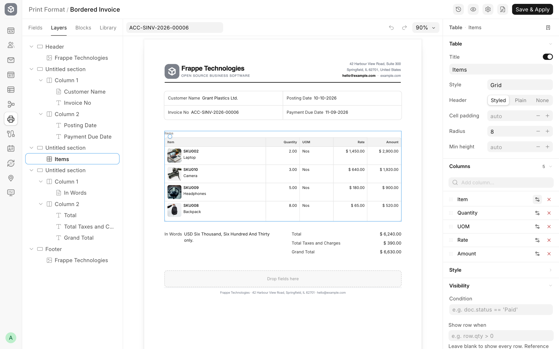
Table
| Setting | Options | What it does |
|---|---|---|
| Title | text, with Show title | A heading above the table, for example "Items". |
| Style | Grid, Rows, Striped, None | Grid draws all lines. Rows draws lines between rows only. Striped shades every other row. None draws no lines. |
| Header | Styled, Plain, None | Styled gives the header row a background. Plain prints it as normal text. None hides the header row. |
| Cell padding | pixels | Space inside each cell. |
| Radius | pixels | Rounds the corners of the table. |
| Min height | pixels | Keeps the table at least this tall, even with few rows. Useful for pre-printed stationery. |
Columns
The Columns list shows the columns in print order, with their count at the top.
- Add a column: type in Add column... and pick a field. Sr No. adds the row number.
- Reorder: drag a column by its grip.
- Rename: click the column name and type a new heading.
- Remove: click the × next to it.
Click the settings button next to a column for more:
| Setting | What it does |
|---|---|
| Width | The column's share of the table, in percent. Leave empty to share the space equally. |
| Date format | For date columns. |
| Merge fields | Show more fields in the same cell, under the main value. See below. |
| Show column when | Print the column only when a condition about the document is true. |
A column whose cells are empty in every row is left out automatically, and the other columns grow to fill the space.
Merge fields into one cell
Merging lets one cell carry several values, for example the item name in bold with its code and description below it in grey.
- Open the settings of the column, for example Item.
- Under Merge fields, click Add field... and pick a field, for example Description.
- Pick a style for each merged field. The column's own field always prints first, in the Primary style.
| Style | Looks like |
|---|---|
| Primary | Bold, dark text |
| Secondary | Normal weight, dark text |
| Code | Small grey monospaced text, for codes and SKUs |
| Muted | Small grey text, for long descriptions |
The first field you add starts as Secondary and the next ones as Muted.
An image field, such as the item image, gets a size setting instead, so you can print a small thumbnail next to the item name.
- Set Direction to Vertical to stack the values, or Horizontal to put them side by side.
Style
| Setting | What it does |
|---|---|
| Header | Background colour of the header row. Shown when Header is Styled. |
| Border | Colour of the lines. |
| Custom CSS | Your own CSS for the table. |
Visibility
| Setting | What it does |
|---|---|
| Condition | Print the whole table only when this is true. |
| Show row when | Print only the rows for which this is true. Use row. to refer to the row's fields. Leave blank to print every row. |
Some examples for Show row when:
row.qty > 0                      # skip zero quantity rows
row.item_group != "Services"     # leave out service items
not row.is_free_item             # hide free items
See Show or hide content for how conditions work.